
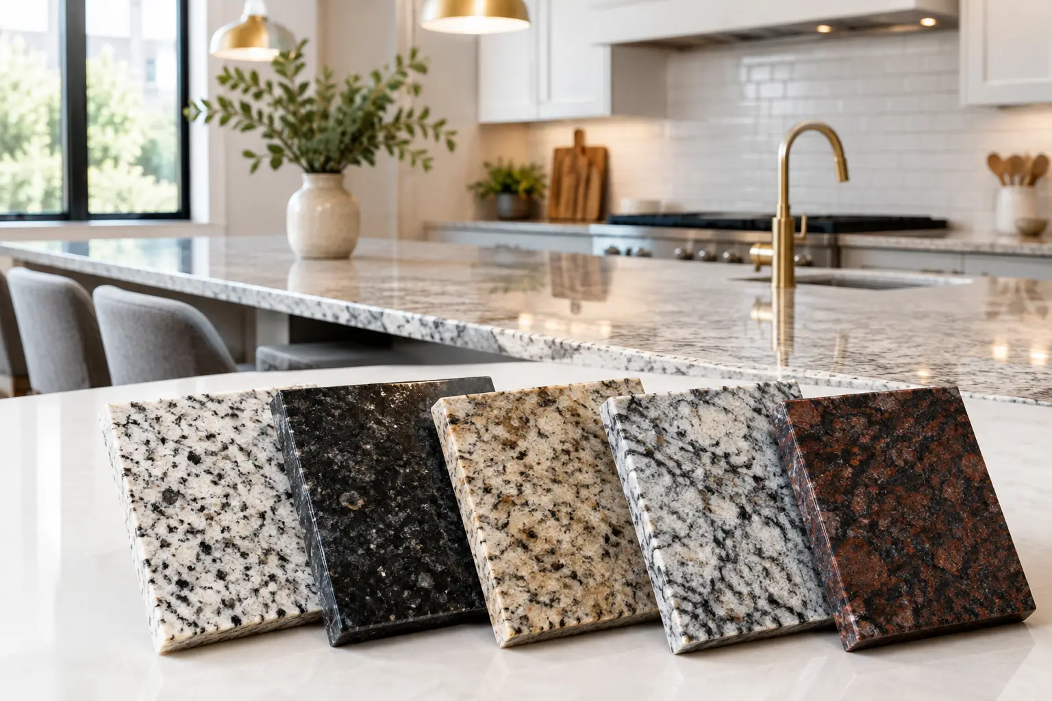
A kitchen worktop is seen in the first light of morning, beneath the warmth of pendant lamps and at the centre of long evenings around the table. That is why choosing the best granite colours for kitchens is not simply a matter of following a trend. It is a decision about atmosphere, proportion and the distinctive geological character that will accompany daily life for decades.
Granite brings a particular authority to a kitchen. Dense, enduring and naturally varied, it offers a surface with depth that manufactured materials can imitate but never repeat. The right colour does more than coordinate with cabinetry: it can make a compact room feel composed, give a generous space greater intimacy, or become the quiet focal point of a bespoke interior.
How to Choose the Best Granite Colours for Kitchens
Begin with the room rather than a sample. A small stone swatch cannot reveal how a slab will respond to a north-facing window, a burnished brass tap, oak joinery or the soft shadows cast by an island. Granite is a natural material, formed under extraordinary pressure over immense time. Its veining, mineral flecks and shifts in tone are part of its beauty, not imperfections to be designed away.
Light is the first consideration. Kitchens with abundant daylight can carry deeper granites with confidence, while rooms with limited natural light often benefit from pale or mid-toned stone that reflects illumination across the work surface. Artificial lighting matters just as much. Warm lighting can draw golden and brown notes from a cream granite, whereas cooler lighting may emphasise grey, blue or charcoal minerals.
The scale of the pattern deserves equal care. A dramatic slab may be magnificent across a large island, especially when bookmatched as a sculptural feature. In a smaller kitchen, however, a quieter grain can provide elegance without visual congestion. There is no universal rule. A richly figured stone can work beautifully in a compact room when the cabinetry is restrained and the architectural details are precise.
See the Whole Slab, Not Only a Sample
Commercial names are useful starting points, but they are not a promise of identical appearance. Even slabs from the same quarry may differ in background tone, movement and mineral composition. Selection should therefore take place on the full slab whenever possible.
At Torchio Marmi, this is treated as an essential part of the design process. The chosen slab informs the placement of cut-outs, the direction of veining, the relationship between worktop and upstand, and the details around a sink or hob. Such decisions turn stone from a surface into an integrated architectural element.
White and Pale Granite for Light-Filled Kitchens
White granite remains a refined choice for kitchens that seek brightness without the uniformity of a plain white surface. It commonly carries silver, graphite, taupe or warm mineral markings, which give it a more forgiving and layered presence than a flawless pale finish.
For a contemporary kitchen, a white granite with cool grey movement can sit beautifully beside lacquered white cabinetry, smoked glass and brushed stainless steel. For a more classical setting, choose a stone with cream, sand or soft gold notes. Paired with painted joinery in warm white, mushroom or sage, it creates an interior that feels settled rather than stark.
Pale granite is especially effective on a substantial island. It catches daylight and gives the centre of the room a sense of openness, yet its natural grain prevents it from becoming clinical. The trade-off is that pale surfaces may make dark crumbs, red wine splashes and strong pigments more immediately visible until wiped away. A properly sealed granite is highly practical, but daily care remains part of preserving its finish.
Grey Granite: A Quietly Architectural Choice
Grey is among the most adaptable granite colours for a kitchen. It can be pale and silvery, smoky and layered, or nearly black with a soft graphite cast. Its strength lies in balance: grey gives definition without demanding all the attention.
A light grey granite suits contemporary interiors with pale timber, limed oak or matt cabinetry in stone and clay shades. It also provides a composed bridge between cool metal details and warmer natural materials. Mid-grey stones have particular value in active family kitchens and entertaining spaces because they conceal the minor traces of everyday use more readily than very pale or very dark surfaces.
Darker grey granite can create a more formal, metropolitan mood. Combined with walnut, bronze and textured plaster, it has a depth that feels both modern and enduring. If the room has limited daylight, offset the stone with a lighter wall treatment, carefully placed task lighting and cabinetry that does not absorb all available light.
Black Granite for Drama and Permanence
Black granite has a presence few materials can equal. Polished, it can reflect light with almost ceremonial depth; honed, it becomes quieter, more tactile and distinctly architectural. It is a powerful choice for kitchens where the island is intended as a monolithic centrepiece.
Absolute black or very dark granite works particularly well with pale oak, walnut, ivory cabinetry and metal details in brass or aged bronze. In historic homes, it can offer a confident contrast to ornate cornices, timber beams or traditional joinery. In more minimal interiors, it sharpens the geometry of the room.
The practical consideration is maintenance of appearance rather than durability. On a highly polished black surface, water marks, dust and fingerprints can be more noticeable in strong side light. A leathered or honed finish may be more forgiving, although it will have a softer sheen and a different tactile quality. The finish should be selected with the same care as the colour.
Warm Granite Colours for Welcoming Kitchens
Granite in beige, cream, brown, gold or muted rust tones can bring an immediate sense of warmth to a kitchen. These colours are often overlooked in favour of stark monochrome schemes, yet they possess an enduring affinity with timber, terracotta, aged metals and the layered materials of Italian interiors.
A warm, finely grained granite can complement oak cabinetry and limestone-toned flooring without making the room feel overly rustic. Stones with golden mica or gentle brown movement are especially effective in country houses, villas and period properties, where they echo the natural variation found in old timber and handmade plaster.
The risk is not warmth itself, but excess. Where the granite carries rich gold or brown tones, avoid matching every surrounding finish too closely. A cooler painted cabinet colour, blackened metal hardware or a restrained splashback can give the composition clarity. Contrast allows the stone to remain expressive.
Blue, Green and Deeply Veined Granites
For kitchens intended to make a more individual statement, granites with blue, green or pronounced mineral movement offer extraordinary possibilities. These are stones chosen less as background and more as works of natural art. Their colours can recall deep water, forest shade, storm clouds or the patina of aged bronze.
A blue-grey granite can lend distinction to a kitchen with dark timber and brushed nickel, while green-toned material can be remarkable alongside warm ivory, tobacco brown or bronze. Heavily veined slabs deserve space around them. Let the cabinetry be calm, repeat one or two tones from the stone elsewhere in the room, and avoid competing patterns in floors, tiles and fabrics.
These expressive granites are often best used across an island, a full-height splashback or a framed wall detail, where their movement can be appreciated from a distance. The fabrication must honour the slab's natural drawing. Vein direction, joins and edge profiles should support the composition rather than interrupt it.
Cabinetry, Finish and Edge Detail Change the Colour
Granite never appears alone. A charcoal stone beside crisp white cabinetry reads differently from the same stone beside black oak. Similarly, a pale granite may feel contemporary with a square, fine edge and more traditional with a shaped profile.
Polishing intensifies colour and brings mineral crystals into sharper view. Honing softens reflection and often makes a stone appear lighter or more velvety. Leathered finishes introduce texture and can lend darker granites a more relaxed, tactile character. None is inherently superior: the appropriate finish depends on the light, the intended use and the wider language of the interior.
Consider the thickness of the worktop as well. A substantial edge can give a richly patterned granite monumental weight, while a slimmer profile may suit a pared-back architectural scheme. Details around drainage grooves, undermounted sinks and upstands should be resolved early, because technical precision protects the visual calm of the finished kitchen.
The most successful granite kitchen is not built around a fashionable colour name. It begins with a slab that speaks to the room, then gives that material the craftsmanship, light and proportion it deserves. Chosen in this way, granite becomes more than a work surface: it becomes part of the home's memory, marked by use and still beautiful long after fashions have moved on.